Apache POI Word - Pie Chart
Overview
This article describes how to use Apache POI to generate a pie chart in a Word document. The document format requirement is docx, corresponding to XWPFDocument in Apache POI. The complete source code will be provided at the end of the article.
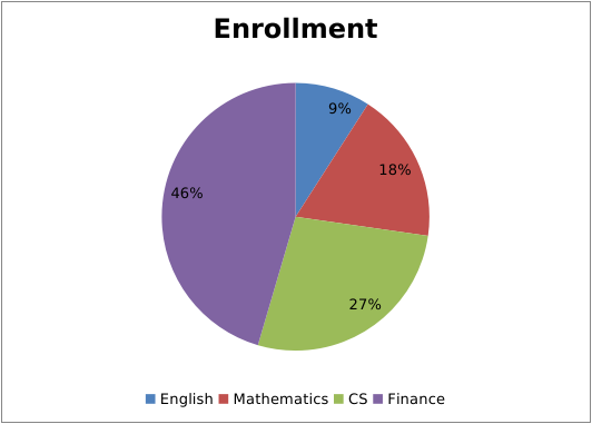
The final pie chart to be implemented
Before we begin, let's show the final pie chart that we are going to implement. This pie chart visually represents the proportion of elective enrollments in different majors.

Pie chart demo source
The complete source code on Github
1、Create a pie chart and set a title for it
XWPFDocument document = new XWPFDocument();
XWPFChart chart = document.createChart(14 * Units.EMU_PER_CENTIMETER, 10 * Units.EMU_PER_CENTIMETER);
chart.setTitleText(chartData.getTitle());
chart.setTitleOverlay(false);
2、Set data source for the pie chart
The pie chart has two data sources: one is the category data source, and the other is the value data source, which represents the numerical values corresponding to each category. Referring to the above diagram, there are four categories: English, Mathematics, Computer Science, and Finance. The value data source consists of the number of elective enrollments for each major.
// the category data source
XDDFCategoryDataSource categoryDS = XDDFDataSourcesFactory.fromArray(new String[]{"English", "Mathematics", "CS", "Finance"});
// the value data source
XDDFNumericalDataSource<Number> valueDS = XDDFDataSourcesFactory.fromArray(new Integer[]{10, 20, 30, 50});

XDDFChartData data = chart.createData(ChartTypes.PIE, null, null);
XDDFChartData.Series series = data.addSeries(categoryDS, valueDS);

// To display information such as percentages on a pie chart, you need to call the following method:
series.setShowLeaderLines(true);
The above code uses two lines of code to bind the data source to the pie chart for the convenience of calling series.setShowLeaderLines(true). However, it is actually possible to bind the data source with just one line of code:
XDDFChartData data = chart.createData(ChartTypes.PIE, categoryDS, valueDS);
3、Set the legend and plot the chart
XDDFChartLegend legend = chart.getOrAddLegend();
// legend postion
legend.setPosition(LegendPosition.BOTTOM);
// differentiate the colors for each category
data.setVaryColors(true);
// plot the chart
chart.plot(data);
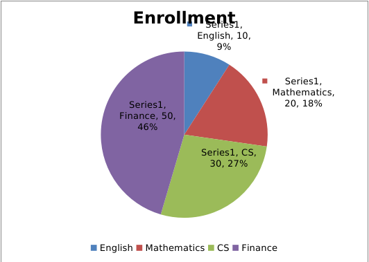
At this point, the basic drawing of the pie chart in Word using the Apache POI API is almost done. When you run the program, you will get the following result:

It can be observed that this chart is slightly different from the final result shown at the beginning. Specifically, each pie slice not only displays the percentage but also includes legend labels, series names, category names, and values. If you want to hide this additional information and only display the percentage, how can it be achieved?
To have flexible control over the visibility of categories, series, values, etc., let's define the following methods first:
// control the visibility of the category name
public void showCateName(CTPieSer series, boolean val) {
  if (series.getDLbls().isSetShowCatName()) {
    series.getDLbls().getShowCatName().setVal(val);
  } else {
    series.getDLbls().addNewShowCatName().setVal(val);
  }
}

// control the visibility of the value
public void showVal(CTPieSer series, boolean val) {
  if (series.getDLbls().isSetShowVal()) {
    series.getDLbls().getShowVal().setVal(val);
  } else {
    series.getDLbls().addNewShowVal().setVal(val);
  }
}

// control the visibility of the serie name
public void showSerName(CTPieSer series, boolean val) {
  if (series.getDLbls().isSetShowSerName()) {
    series.getDLbls().getShowSerName().setVal(val);
  } else {
    series.getDLbls().addNewShowSerName().setVal(val);
  }
}

// control the visibility of the legend labels
public void showLegendKey(CTPieSer series, boolean val) {
  if (series.getDLbls().isSetShowLegendKey()) {
    series.getDLbls().getShowLegendKey().setVal(val);
  } else {
    series.getDLbls().addNewShowLegendKey().setVal(val);
  }
}
After having the above methods, before drawing the chart, you can call the mentioned methods to hide the legend labels, series names, category names, and values, and keep only the percentage.
// hide the legend labels, series names, category names, and values
XDDFPieChartData.Series s = (XDDFPieChartData.Series) series;
CTPieSer ctPieSer = s.getCTPieSer();
showCateName(ctPieSer, false);
showVal(ctPieSer, false);
showLegendKey(ctPieSer, false);
showSerName(ctPieSer, false);
chart.plot(data);
// Save the doc
try (FileOutputStream fo = new FileOutputStream("D:\\pie.docx")) {
    document.write(fo);
}
The complete source code on Github
POI maven dependencies
<dependency>
    <groupId>org.apache.poi</groupId>
    <artifactId>poi-ooxml</artifactId>
    <version>5.2.3</version>
</dependency>
<dependency>
    <groupId>org.apache.poi</groupId>
    <artifactId>poi-ooxml-full</artifactId>
    <version>5.2.3</version>
</dependency>
Note: If you only need to draw a pie chart, you may not need to include poi-ooxml-full. However, when drawing line charts or other types of charts, you will need to include this dependency. Finally, it is necessary to emphasize that the required dependencies may vary depending on the version of Apache POI you are using. Please refer to the official documentation for specific instructions related to your chosen POI version.
Different versions of Apache POI may have different requirements for the ooxml-schema. Choosing the wrong version may result in some strange errors.

You might also be interested in drawing line charts and bar charts using XWPF
Notice:Feedback requires logging into the system first.


